Mine Quest
My First Incremental Game

2015
Incremental "RPG"
Solo

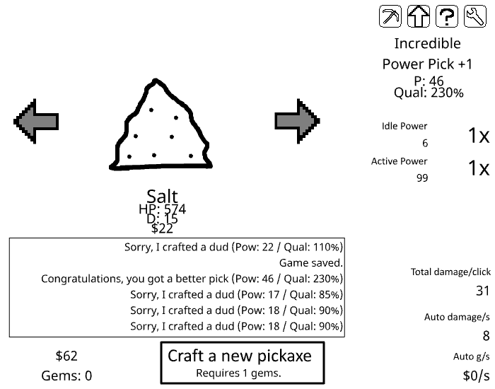
MineQuest, the game that inspired Idle Mine and the pinnacle of UX design.
With Mine Quest, I set out to create a similar kind of game, but with focused improvements made to the specific areas I had identified as weak. Despite being my first incremental game, Mine Quest performed very well, accumulating over 700k plays and securing my biggest sponsorship deal at the time, a branding and distribution agreement with a Flash game portal called GamesButler.
As mentioned above, my primary goal with Mine Quest was to improve on the relatively crude but fun design I had found in Idle Mine. There were two primary issues I sought to solve:
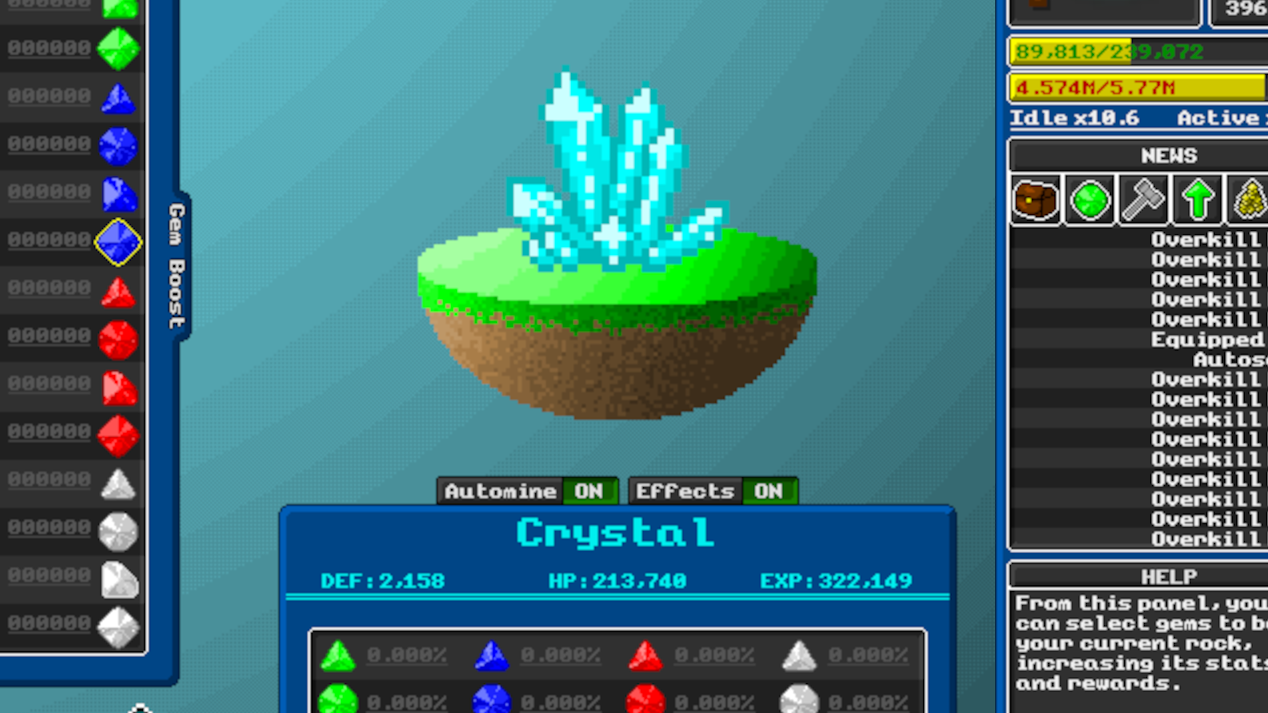
- The game was ugly. Not only did it lack visual polish, but it lacked visuals of any kind outside of some MS Paint drawings of various rocks. A big part of the appeal of Idle Mine, I found, was finally finishing a rock and getting to see what the next one was. I thought it was really a shame that this fundamentally aesthetic part of the game didn’t come with appropriate visuals despite its fundamental importance in keeping the player engaged.
- Progression was extremely linear. The gameplay loop revolved around two currencies, Gems and Money. Both of them could be used in precisely one way – Gems were crafted into new picks, and Money was used to buy passive upgrades. There was no way to engage with your loot outside of clicking on the “craft pick” button or the most relevant upgrade in the store. By introducing more varied ways to interact with currencies and crafting, I hoped to enhance a player’s sense that they were participating in the game, rather than passively performing a chore while their number goes up.
A few of the many sprites I made for Mine Quest
As an added bonus, the basic skills I developed working on these sprites proved to be a valuable asset, forming the foundation I needed to convincingly sell the specific look-and-feel I would go on to use in many of my later games.
While the specifics aren't particularly interesting, I’ll outline here some of the systems I introduced to combat the feel of linear non-interactive progression that I wanted to avoid:
 While these changes did indeed alleviate some of the problems I identified with Idle Mine, I would overall consider the results unsatisfactory. The feeling of “non-participation” early on was dimished as intended, but these changes lacked the sophistication to add much depth or nuance as a player continued to progress in the game. This resulted in an endgame based on fairly formulaic gameplay patterns which ultimately only somewhat improved on the long-term experience in Idle Mine, although it did extend the lifespan of the discovery experience considerably.
- Multiple uses for gems: In addition to being used as a component for crafting pickaxes, gems could also be used to “Gem Boost”, empowering the current rock while also boosting the rewards earned from mining it. Ultimately this system ended up fairly under-utilized due to poor numerical balancing, but it did provide some space for players to explore in the early and mid game.
- Instead of simply providing the player with money when mined, each “rock” would drop a unique resource. This resource could be sold to purchase upgrades or used as an additional component for crafting new picks.
- In addition to requiring both a gem and a material, picks could also be crafted in parts, adding more depth to the pick-crafting process. Players could craft both pick heads and handles, and then combine a head and handle of their choice to produce the pick they want.
- In addition to dropping its own material, each rock was given unique drop rates for each type of gem. This provided room for players to make the strategic choice between mining rocks for gem output or material output.
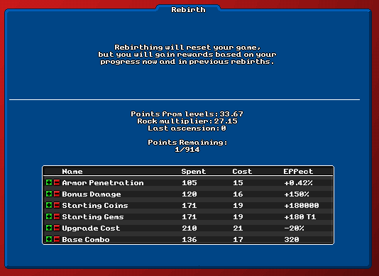
- Finally, I introduced a “prestige mechanic” called Rebirth, allowing the player to reset their progress in exchange for special upgrades. A staple in incremental games, this kind of system was something Idle Mine was strangely missing. This kind of prestige system would be a central mechanic that played a critical role the in the design of all of my future incremental games, due to the uniquely compelling psychological appeal it provides.

The Rebirth system was fairly bare-bones compared to
later prestige systems I would work on.
One other thing that I was not particularly satisfied with in Mine Quest was the numerical balance. In my focus on progression variety and visual polish, I failed to capture one of the essential parts of an incremental game – how all of the numbers interact with each other. With the inclusion of additional progression systems not present in Idle Mine, I introduced several new variables that I hadn’t accounted for in the overall balancing.
As a result of the exponential nature of how these systems interact with and amplify each other, progression tends to feel excessively fast at times, and very slow at other times. This is a topic I would revisit many times in later games, eventually arriving at what I consider to be a very solid balancing of much more complex systems in Press the Button.
As a result of the exponential nature of how these systems interact with and amplify each other, progression tends to feel excessively fast at times, and very slow at other times. This is a topic I would revisit many times in later games, eventually arriving at what I consider to be a very solid balancing of much more complex systems in Press the Button.