Press the Button
Exploring Depth in Incremental Games

2020
Incremental RPG
Solo
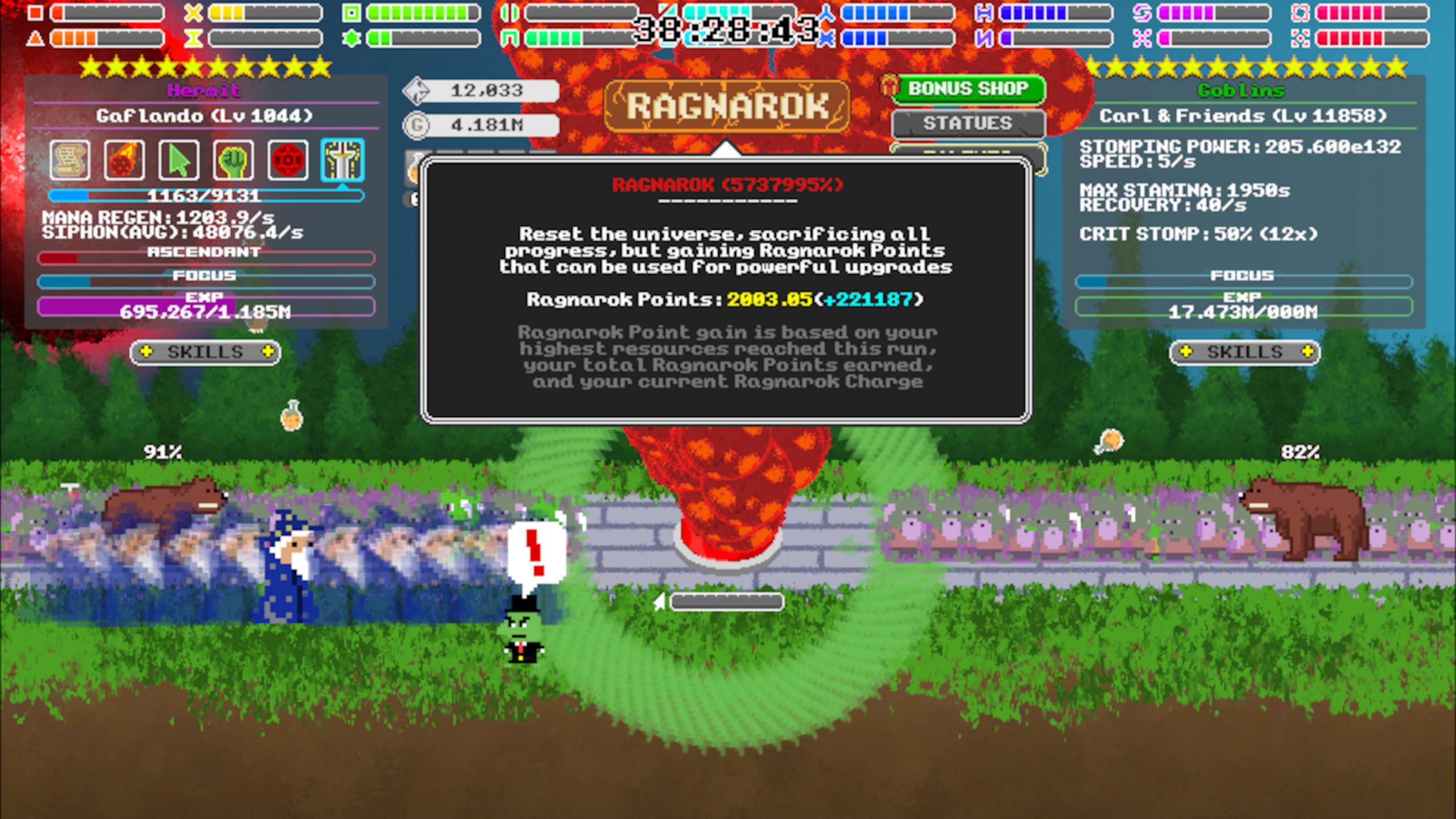
Press the Button was my most recently published Flash game, as well as my most successful to date, with over one million plays and a score in the top 0.1% of all games published on Kongregate. It’s an incremental game in which the player’s goal is to “press the button” as many times as possible, employing goblins, wizards, and even ending the world to do so.
At the time I started work on this project, I had previously experimented with several incremental games, both because of my own personal fascination with the genre as well as the fact that these were the most consistently played games within the dwindling Flash game community.
My prior incremental games had been smaller in scope and largely exploratory, testing out various concepts and how they could be used within the genre. Feeling comfortable with the experience I had acquired, I decided to build one more, this time with three main goals:

- Utilize the experience I'd developed with the various principles, techniques, and characteristics of the genre to create a solid foundational design for the game.
- Achieve tighter and more robust numerical balancing than I had in previous games. Largely devoid of moment-to-moment gameplay, incremental games live and die by the numbers and stats players can achieve over time, and my previous games hadn’t achieved a very elegant balance in that regard.
- Substantially improve the strategic depth my game offered in order to keep gameplay interesting and compelling at a high level. While incremental games tend to have a long lifespan by default – due to the habit-forming power of certain design elements as well as an intrinsic human fascination with numbers going up – my previous projects in the genre all tended to see gameplay fall into a routine after the midgame. With this game I wanted to provide opportunities for players to re-evaluate their choices, invent new strategies, and change how they played the game even very late into the gameplay experience.

Some years after release, I received an email from a fan informing me that my game had spawned not one, but TWO comically faithful and comically low-effort knockoffs.

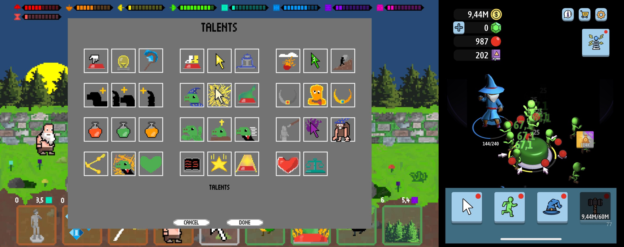
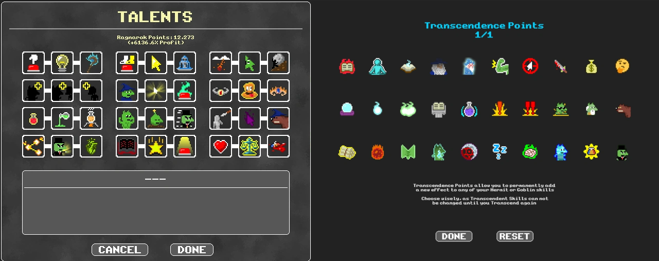
Talents and Transcendent Skills are two of five overlapping upgrade systems the player unlocks.
- Multiple parallel progression routes which all contribute to the same main progression axis. At the lowest level of abstraction, the player controls both a Wizard and an army of Goblins, and can opt into upgrades that benefit one or the other. This choice remains relevant throughout the entire experience, with some players choosing to focus on one or the other, and some players switching between the two depending on their needs at the time.
- Several distinct, centralizing playstyle options without an obvious hierarchy of effectiveness. The player is presented with many choices which all have substantial impact on the core gameplay loop, and which each require different strategies and play-patterns to take full advantage of.
- An achievement system which incentivizes players to explore different builds and strategies. Each achievement provides a tangible benefit, and collecting all of them is impossible without trying numerous different strategies and exploring diverse mechanics and interactions.
- Progression systems involving choice and opportunity cost provide several layers of overlapping decision-making, allowing players to explore fairly deep in theorycrafting their own strategies and builds.
One particularly powerful psychological hook I wanted to explore involved the use of multiple currencies near the beginning of the game. Prior experimentation had showed that introducing multiple tiered currencies was an extremely effective way to keep players engaged until they were comfortably interacting with the core gameplay loop. What I really didn’t want, however, was to dilute the early gameplay experience with the chores that often come along with managing multiple currencies.
As an experiment, I decided to visually fake the presence of multiple currencies. I set up a hierarchy of currencys that were automatically exchanged upwards at a rate of 1:10 (similar to the copper/gold/silver paradigm in many RPGs, but with about 20 more tiers.) The allowed me to present the player with a single progression axis to manage while visually plugging into some of the important psychological elements that can make a multi-currency system engaging. Even the simple drive to see the next shape and color in the sequence provided a strong motivation for players to stick around to “unlock” the next digit of currency, without in any way compromising on the mechanical function I wanted players to engage with at this point in the game.

As an experiment, I decided to visually fake the presence of multiple currencies. I set up a hierarchy of currencys that were automatically exchanged upwards at a rate of 1:10 (similar to the copper/gold/silver paradigm in many RPGs, but with about 20 more tiers.) The allowed me to present the player with a single progression axis to manage while visually plugging into some of the important psychological elements that can make a multi-currency system engaging. Even the simple drive to see the next shape and color in the sequence provided a strong motivation for players to stick around to “unlock” the next digit of currency, without in any way compromising on the mechanical function I wanted players to engage with at this point in the game.

An orange cross is worth 10 red circles, A green donut is worth 10 orange crosses, and so on ...
I was quite pleased to learn some months after releasing the game that players hat put together a community wiki. I’d like to highlight a comment from the this player's guide that makes me especially proud as a designer:
“This game and a lot of the math behind decisions is complicated so I'm sure some of my strategies aren't optimal. They are however really good. It's quite a bit of fun thinking of and testing strategies on your own so read at your own risk. Even after a month of playing, I'm still thinking of new optimal strategies.”
Copyright © 2023 by Tazz Stieglitz