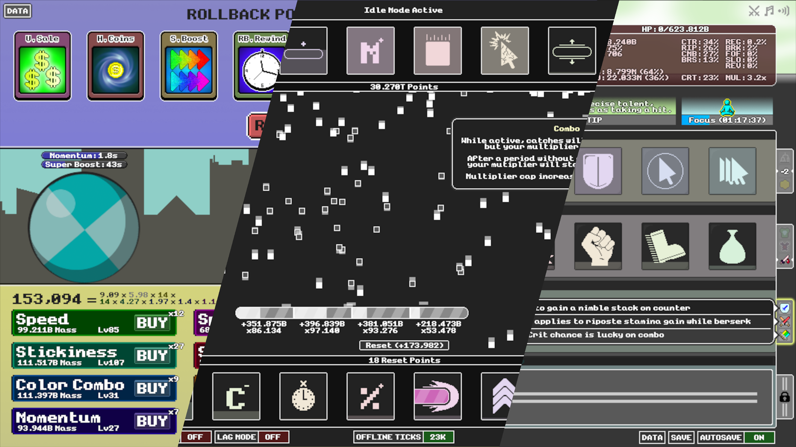
Idle Roller, Idlefall & Idle Fight
Diving Into Incremental Games

2017
Incremental Games
Solo
In between Mine Quest and Press The Button, I developed and released three other incremental games. While none of these individually warrant their own section, collectively these games bridge the gap between the relatively rudimentary design of Mine Quest and the more cohesive, nuanced design of Press The Button.

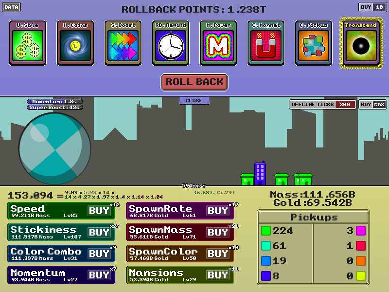
Idle Roller! I can't think of a caption!
As a designer, this constraint prompted me to think very lean. While Mine Quest had taken anything and everything from Idle Mine, raising the complexity under the pretext of “more is better”, Idle Roller instead took the opposite approach. I had to distill down the core concepts that typically make an incremental game fun – the numbers going up.
I started with a very basic premise – the player has a ball, and they want it to roll over as much stuff as possible (Katamari, anyone?). Any part of the design beyond that would be abstract and numerical in nature, allowing me to focus on the numbers and progression. A ball and some nondescript rectangles to roll over (ultimately replaced by minimalist sprites of houses and a simple city skyline for a background) provided a cohesive theme whilst wasting virtually no time on asset production.
Idle Roller took roughly two weeks to develop, and ultimately satisfied my initial design goals, filling out a more streamlined, balanced, and elegant design than Idle Mine. Still, there was a lot to learn, as I would go on to discover during the course of my following projects.

The “Idle” naming convention was a popular approach for incremental games at the time, signifying that the player could continue to progress even while inactive.
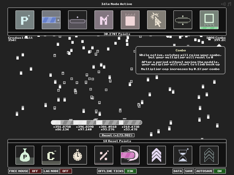
The original design I started with was extremely simple – a bar that filled over time and would grant a reward upon filling. While this was certainly pushing the limits of minimalism, early testing showed that without some sense of physicality, a lot of the excitement of “numbers going up” diminished. Without a tangible and at-a-glance tractable representation of a player’s progress, it’s difficult to feel the weight of an upgrade or improvement. When a player comes back on day two, the player needs to be able to very comfortably say “Wow, I’m so much (faster|bigger|cooler) than yesterday”.
This rationale prompted the idea that would ultimately become Idlefall: catching blocks to fill the bar, with a breakout-style paddle. The number and speed of falling blocks acts as a very tangible indicator of progress, while still allowing me to keep the bar-filling mechanic that I had constructed a design around. Additionally, the physical nature of the blocks provided some context for additional variety in upgrades.
Idlefall out-performed Idle Roller in terms of both popularity and player ratings, signaling that I was making progress in my designs. After a development cycle of around 3 weeks, I felt I had achieved the lean design I set out to capture, and just like Idle Roller, had made numerous incremental (ha) improvements over my previous project.

RPG systems make everything better.
Coming up with the core gameplay context for this project was a very easy process. A classic RPG-style battle provided the perfect environment for the kind of mechanical depth I had in mind. Early on I toyed with the idea of a robust battle system with unique attacks and abilities, but ultimately I concluded that, for an incremental game where passive improvement is a big part of the draw, opting for an automated battle system focused on passive effects was the more appropriate choice.
To provide the player with a breadth decision-making opportunities, I designed three main progression systems, all of which I would go on to refine later in Press The Button.
- Multiple simultaneous prestige layers: Respectively named “Wish”, “Proclaim”, and “Transcend”, a player could opt to reset their progress for boons on any of three prestige axes at any given time – the catch being that the player could only choose one. This added a routing element in which the player would have to decide if they wanted to end a run, eg, in a Wish or a Proclaim, depending on what kind of upgrades they wanted to pursue next.
- Emphasized opportunity-cost: In my previous games, a player would acquire more-or-less all of the upgrades over time. Combined with the exponential nature of rewards, this meant that the purchase order (or the decision to not purchase a certain upgrade) was largely irrelevant. In Idle Fight, I made prestige resources much more finite, prompting players to choose carefully which upgrades they spend them on.
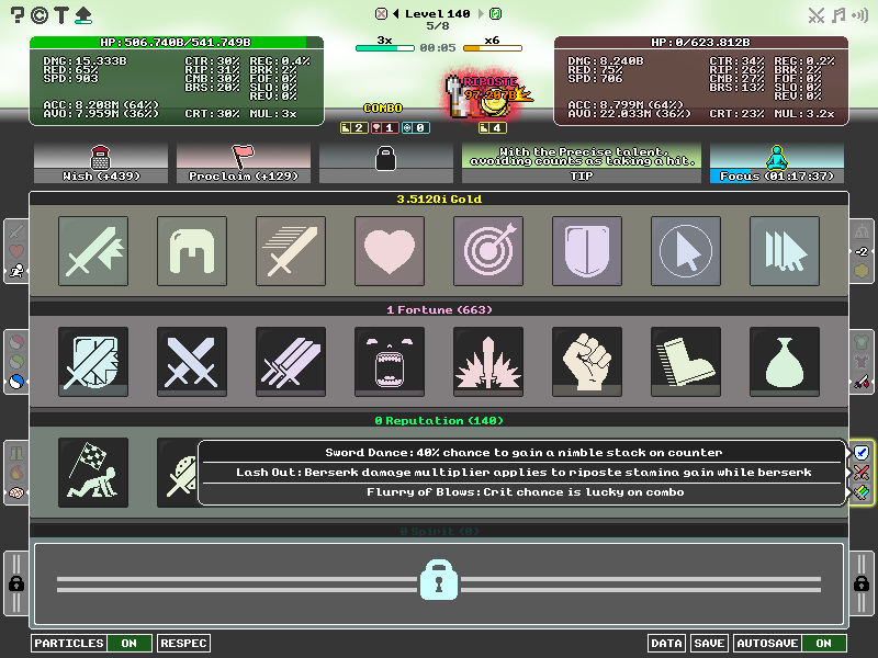
- One-of-Three Talent Selection: At various points in a run, a player would be prompted to choose only one upgrade from a selection of three, locking the other two for the rest of the run. This paradigm has since become a staple of the roguelike genre, and I like to take some credit for my early insight into the efficacy of this technique.

An example of a Talent choice in Idle Fight