Slide Knight
A puzzle game modeled after “the floor is ice” puzzles from many JRPGs

2017
Puzzle Game
Solo
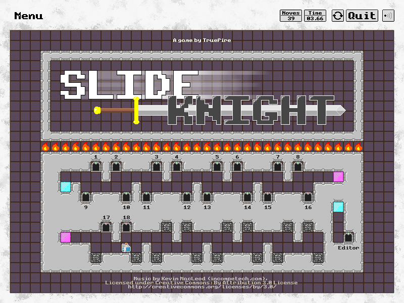
Did you play through those ice-floor sliding puzzles in Pokemon and say "I wish there was a full game based on this mechanic"? No? Well, I guess most people didn't like those puzzles. But I did! And that's how Slide Knight was born. There's not much more to it than that -- Slide Knight is a puzzle game where players play through 32 levels of sliding floor puzzles.

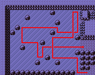
One of the classic ice floor puzzles from Pokemon Silver.
The core of this problem boiled down to the number of options a player can choose from at any given time. With a typical situation in an ice-floor puzzle having only three possible options (the four cardinal directions, minus one blocked off by a wall), it becomes pretty easy for a player to collapse the decision tree once they can identify some of the fundamental patterns that occur in this type of puzzle.
In order to remedy the issue, I took two main approaches:
- Adding new mechanics to keep the player on their toes: Blocks that would change state when you collided with them or passed by them, teleporters, objects that required some amount of "runway" to interact with, etc. The more mechanics I introduced, the longer it would take for a player to deconstruct all the patterns that could emerge and reduce the solution of a new problem to rote application of those patterns.
- Complex level design: As the levels progress, layouts rapidly increase in complexity (in hindsight, probably too rapidly). In order to produce depth in a game with such few decisions to make at any given time, I compensated by making the total number of decisions required to solve any individual level relatively high.

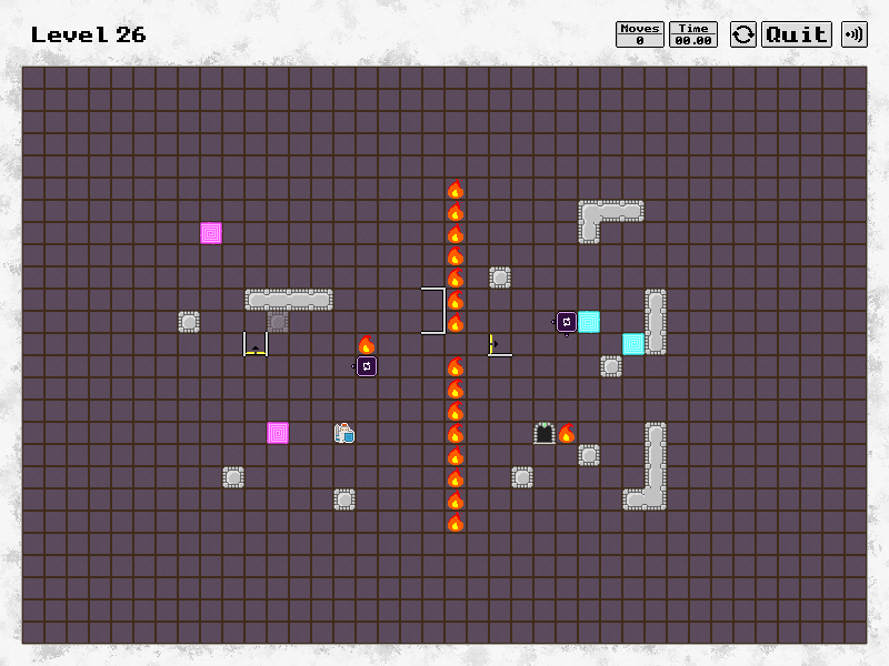
A level of middling complexity.
The core design of Slide Knight involves tapping into a very specific kind of thinking -- one that involves juggling a lot of possibilities at once and reading fairly deep into a decision-tree. This is a very niche type of mental exercise that many people seek to avoid, finding it taxing and stressful. While this conclusion was fairly disappointing, I found it constitued an important lesson into human psychology and helped refine my approach to future puzzles.
At one point I considered simplifying the overall direction of the game, designing levels to achieve a kind of distracted zen instead of the more intense brain-straining puzzling that I had originally intended. Ultimately I chose to maintain the original vision for Slide Knight simply because it was the kind of game I wanted to make.
Fun fact: Slide Knight was originally not Knight themed at all, instead taking a more minimalist vector aesthetic -- the theme was added after-the-fact in an attempt to keep playtesters more engaged.