Shader Reworks
improving RushRev's rendering pipeline and visual style

2020
System Update
Programming, Visual Design
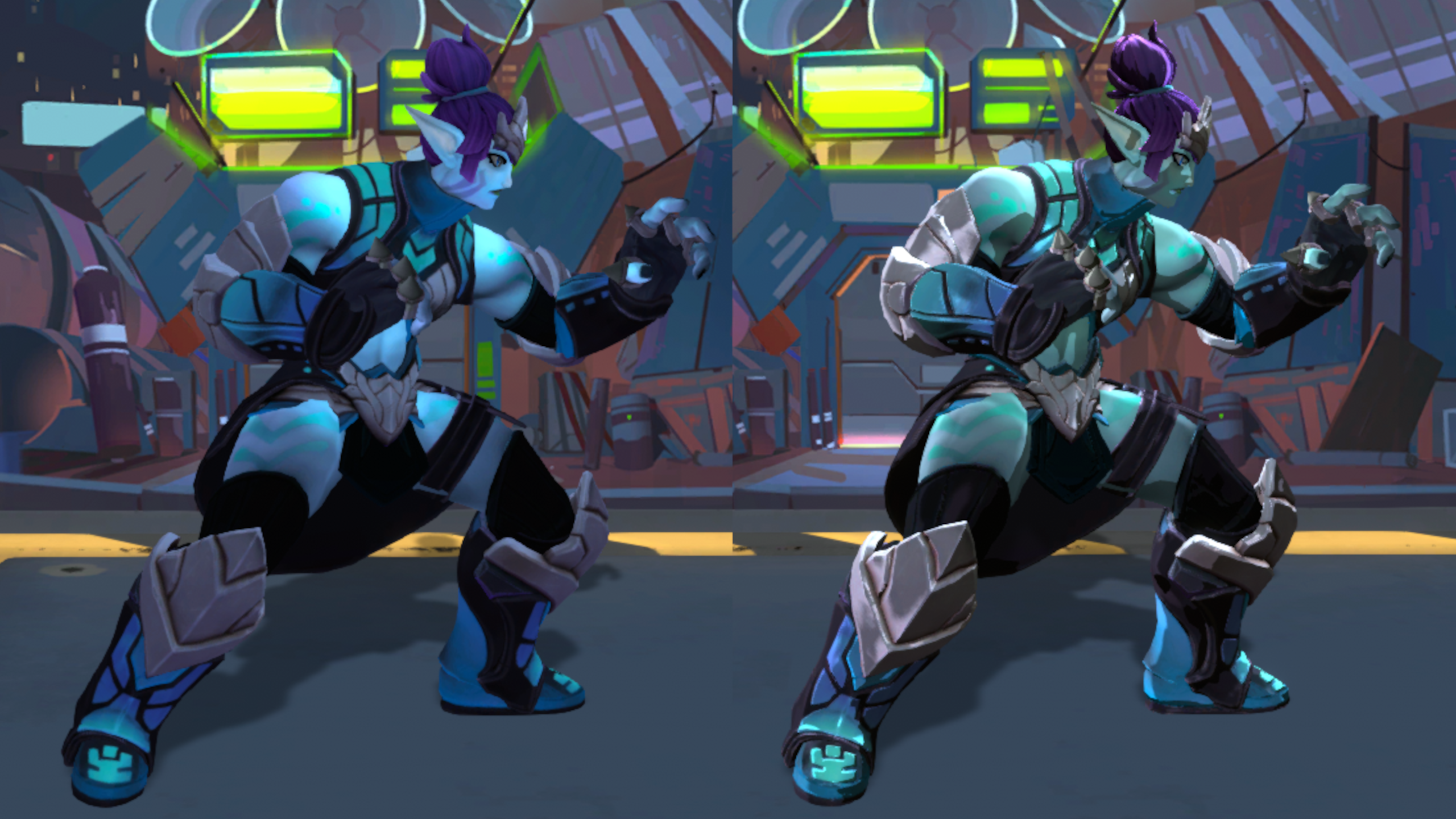
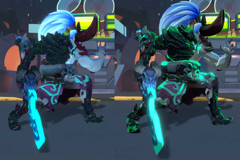
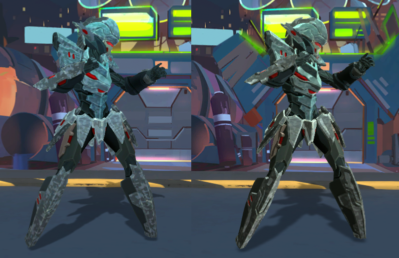
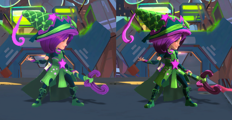
Around a month or two into my time working on Rushdown Revolt, the team began exploring the game’s visuals and how we could potentially improve on what we had inherited from Icons. The assets we had conformed to a flat, fairly low-contrast style. Besides just being generally unappealing, this led to issues with readability – an especially big problem in a fighting game where split-second recognition and reaction is essential.
Without a full-time technical artist on the team, the problem had been left to persist for quite a while. Although my own experience with shaders (especially in Unity) was relatively limited, visual improvements were such a valuable low-hanging fruit that I decided to set aside some time over a weekend to figure out how they work, and to see if I could put together some simple changes that would improve the baseline visual quality of the game.
The project ended up taking about 4-5 days between research and implementation, and while the results are no stand-in for proper work by a qualified technical artist, they did considerably improve our graphical presentation and readability compared to the dull low-contrast shading style we had before.


