Super Business Bob
An extremely difficult platformer with over 30 levels
2016
Twitch Platformer
Solo
I've been a fan of difficult platformers ever since I was a kid, playing games like Mario or Donkey Kong Country. I started building Super Business Bob with the intent to see what it would take to design that kind of platforming challenge for myself. The game followed Bob, a generic salaryman, whose goal was to collect all of the coins scattered across 30 levels (plus 6 secret levels and a final boss that could be accessed after collecting enough coins).
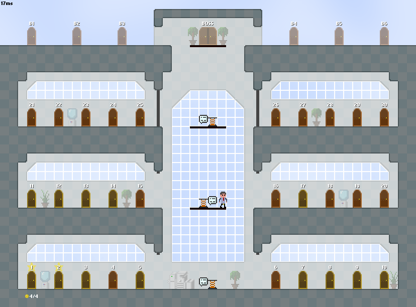
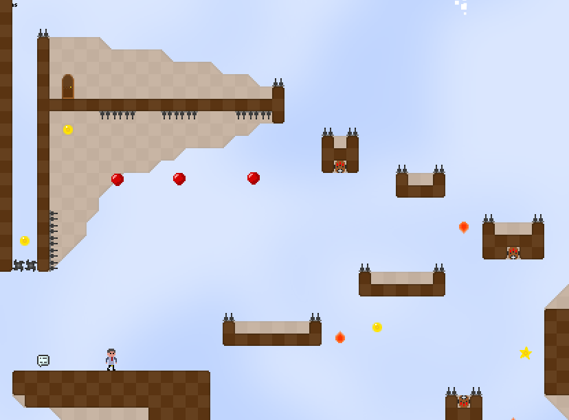
By design, the game featured an extremely steep difficulty curve across the main levels, as well as a ton of even-more-difficult optional content. I wanted a game full of challenges that would require total mastery of the game mechanics and the level structure to complete. In the process of designing as many uniquely sinister platforming challenges as I could, I learned a lot about the limits of human dexterity. I became familliar with different kinds of "physical" difficulty (timing, prediction, reaction, etc.) and how good humans can realistically get at accomplishing various feats within these categories.
This experience would go on to be particularly useful to me in my later design work on the fighting game Rushdown Revolt, a genre that tests the limits of human dexterity, reaction times, and physical consistency.
This experience would go on to be particularly useful to me in my later design work on the fighting game Rushdown Revolt, a genre that tests the limits of human dexterity, reaction times, and physical consistency.
Early on in my paper designs, I found myself feeling that the levels I had designed all blended together. Individual obstacles and challenges stood out, but levels as a whole had less impact that I would have liked. I decided to take a look at what I could do to set levels apart at a glance, and here's what I came up with:
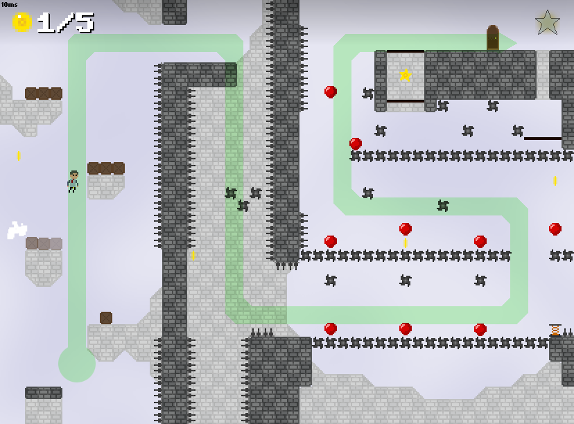
Each level in Business Bob is designed such that the path a player takes through the level forms its own unique shape. I felt that this kind of approach helped distinguish the levels in a very visual sense and got rid of a lot of the “always go to the right” feeling of uniformity present in many platformers. Now a level could be much more easily recognized by its thematic layout, eg "the one where I jump down a hole then climb back up", or just by a very intuitive shape-recognition, eg "the one that's shaped like a U".
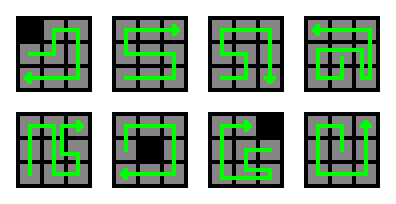
To visualize these level flows and ensure they each felt distinct, I considered each level as a 3x3 grid, and mapped the player's traversal through the default path of the level onto the grid. I did this very early in the paper design stages so that I could tweak level designs before implementation to have a unqiue "macro flow" compared to each of the other levels.
Each level in Business Bob is designed such that the path a player takes through the level forms its own unique shape. I felt that this kind of approach helped distinguish the levels in a very visual sense and got rid of a lot of the “always go to the right” feeling of uniformity present in many platformers. Now a level could be much more easily recognized by its thematic layout, eg "the one where I jump down a hole then climb back up", or just by a very intuitive shape-recognition, eg "the one that's shaped like a U".

Examples of some level flow visualizations. These diagrams helped to quickly catch overly-similar level layouts (eg #2 and #3 above) early on in concepting.
To visualize these level flows and ensure they each felt distinct, I considered each level as a 3x3 grid, and mapped the player's traversal through the default path of the level onto the grid. I did this very early in the paper design stages so that I could tweak level designs before implementation to have a unqiue "macro flow" compared to each of the other levels.

A flow visualization overlaid on its corresponding level.